Every trading brand launching in 2026 hits the same fork in the road. The brand designer shows two directions. One looks like a private bank — navy, serif, restrained, "we've protected wealth for decades." The other looks like a fintech that wants to be your favourite app — bright, animated, gamified, built to make a deposit feel like starting a game.
The instinct is to treat this as a taste question. It isn't. It's a commercial and regulatory question with real money on both sides — and most brands get it wrong by going all-in on one extreme.
Let's settle it with the actual evidence.
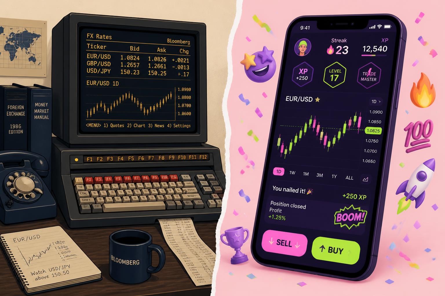
Option A — The Vault · Est. 1987
Old-School Corporate
- ·Navy, grey, serif, "trusted since 1987"
- ·Dense data, disclaimers everywhere
- ·Signals safety & regulation
- ·Invisible to a 22-year-old
Option B — The Playground
Gamified & Gen Z
- ·Confetti, streaks, badges, dark mode
- ·One-tap, dopamine-fast, mobile-first
- ·Wins attention & acquisition
- ·Walking into a regulatory buzzsaw
01 — The case for cool: why "boring" quietly loses the next generation
Start with who's walking in the door. The incoming generation of traders doesn't behave like the buy-and-hold investor your corporate aesthetic was built to reassure. 49% of Gen Z investors trade weekly and 25% trade daily, and 87% invest at least monthly — versus 68% of boomers. They expect always-on, mobile, instant. (We unpacked the full behavioural shift in our Gen Z trading trends analysis.)
And the design world has the receipts on what simplicity does to growth. Robinhood didn't win by out-featuring incumbents — it won by radically simplifying onboarding, portfolio visibility, and order placement, proving that usability isn't cosmetic, it's a growth lever. Clean beats cluttered for a first-time depositor every time.
- 49% of Gen Z trade weekly
- +11–12% trading-volume lift from push alerts and prize draws
- ~75% of retail trades happen on mobile
A genuinely boring, desktop-first, jargon-dense interface doesn't read as "serious" to this audience. It reads as not for me. They bounce before they fund. So far, the playground is winning.
02 — The case against cool: why "cool" is walking into a regulatory buzzsaw
Here's what the "just gamify it" crowd conveniently skips: the exact features that drive those engagement numbers are now the number-one thing regulators are hunting. This isn't a future risk. It's already enforcement.
⚠ Regulatory reality check
The FCA's own study found push notifications and prize draws increased trading volume by 11% and 12% — and pushed younger users (18–34) into measurably riskier portfolios than older ones. Those same "celebratory messages, points, badges and rewards" are the features it flagged as potentially breaching its Consumer Duty.
ESMA ranked digital platform design as its second-highest supervisory priority — above leverage, above product complexity. In an assessment of 154 CySEC-regulated CFD/FX firms, 90% had no policy governing how design choices create conflicts between firm revenue and client outcomes.
Robinhood — the poster child for the playground aesthetic — was charged by the Massachusetts Securities Division over its gamification techniques. The regulators are no longer asking what people trade. They're asking how your interface influenced them to trade.
For a regulated CFD broker or prop firm — especially under ESMA, FCA or CySEC — leaning hard into confetti-and-streaks design isn't edgy. It's building your conversion engine on top of the precise behaviours your regulator has publicly committed to penalising. The "cool" interface can become a compliance liability that costs you your licence, not just a fine. (For the parallel acquisition shift, see how prop firms are stealing CFD brokers' clients.)
The boring interface bores the customer. The gamified interface alarms the regulator. The winning interface in 2026 does neither — it earns trust and attention at the same time.
03 — The real answer: it was never boring vs cool. It's trustworthy vs engaging — and you need both
The framing is a false binary. The data points to a third position that the strongest 2026 platforms already occupy: clarity that feels trustworthy, wrapped in an experience that feels modern. Not a casino. Not a filing cabinet.
Look at what actually works in the design research. Color conventions are non-negotiable — green for gain, red for loss; break them for "aesthetics" and you break trust instantly. Navigation is treated as a trust issue, not just usability: a user who can't instantly find their P&L doesn't think "confusing," they think "unreliable." The winning platforms use progressive disclosure and clean typography to feel effortless — while keeping the serious signals that say your money is safe here.
What that looks like in practice
- Modern, not childish. Dark mode, clean type, fast mobile flows, satisfying micro-interactions on confirmations — not slot-machine reinforcement loops that celebrate the act of placing a risky trade.
- Gamify learning, not risk-taking. Streaks and progress bars belong on the education journey — completing lessons, hitting knowledge milestones — where the FCA itself points to features that "educate users on the associated risks" as the good kind.
- Trust signals stay loud. Regulation, segregation of funds, clear fees and risk disclosure presented cleanly — not buried, not gamified away.
- Friction where it protects, speed where it converts. Fast to deposit and learn; deliberately considered at the moment of high-risk action.
04 — The decision matrix: how to choose, element by element
Don't pick a vibe. Make the call per element — keep the trust-positive corporate instincts, adopt the engagement-positive modern ones, and quarantine the features that trip compliance.
| Element | Keep from "Corporate" | Take from "Gen Z" |
|---|---|---|
| Color & convention | Green-up / red-down, no gimmicks | Dark mode, modern palette, high contrast |
| Onboarding | Proper KYC & risk disclosure | Fast, mobile-first, progressive steps |
| Data display | Accuracy, real P&L, no spin | Progressive disclosure, clean hierarchy |
| Engagement | Restraint around risk actions | Streaks & rewards — on learning, not trades |
| Trust signals | Regulation, fund safety, fees up front | Present them clearly, not in 8pt grey |
| Tone of voice | Credible, no hype, no guarantees | Human, direct, jargon-free |
Synthesised from trading-platform UX research and FCA / ESMA / IOSCO guidance on digital engagement practices. Direction-of-travel guidance, not legal advice — confirm against your own regulator and licence conditions.
05 — The Nexa take: the interface is only half the brand
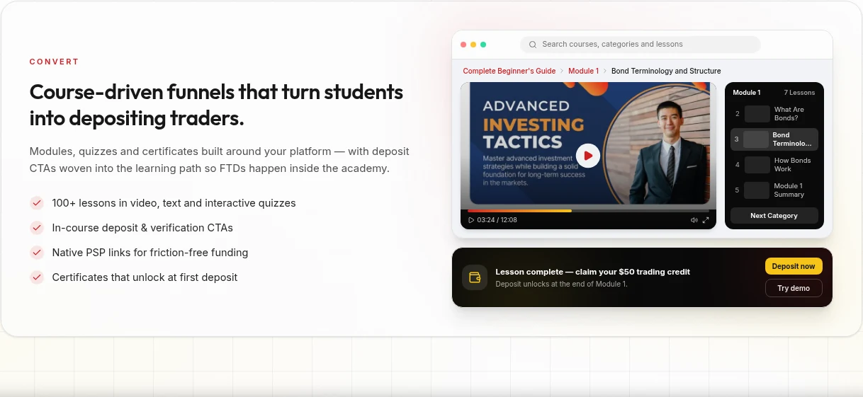
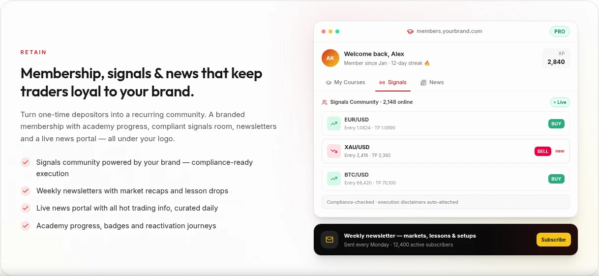
Here's the part most of this debate misses entirely. A trading brand doesn't succeed or fail on whether the buttons are rounded. It succeeds on whether the whole experience earns a deposit and keeps it. The interface is the storefront. The thing that actually converts the modern trader — and keeps you on the right side of the regulator — is education built into the journey.
It's the one feature that is simultaneously what Gen Z wants (they'll happily progress through structured, gamified learning), what regulators reward (the FCA explicitly cites risk-education features as the good use of these mechanics), and what brokers under-invest in. Make the academy the engaging layer, and you get the engagement upside without the compliance downside. That's the needle, threaded. Nexa's White Label Academy is built for exactly this.
Trading interface design in 2026 — FAQ
Should a new trading brand look corporate or gamified?
Neither extreme. The research points to a modern, clean, mobile-first interface that keeps conventional trust signals (green/red conventions, clear fees, visible regulation) while avoiding the engagement-maximising "dark patterns" — confetti on trades, prize draws, streaks tied to risk-taking — that regulators are actively targeting.
Why are regulators against gamified trading apps?
The FCA found game-like features such as push notifications and prize draws increased trading volume by 11–12% and pushed younger users into riskier portfolios. ESMA has elevated digital platform design to its second-highest supervisory priority, and Robinhood has already faced charges over its gamification. The concern is interfaces nudging users to trade against their own interests.
Does a "boring" corporate interface hurt growth?
Yes, if taken to the extreme. Dense, desktop-first, jargon-heavy designs read as "not for me" to younger traders who trade weekly and expect mobile-first simplicity. Robinhood showed that simplifying onboarding and portfolio visibility is a growth lever, not just a cosmetic choice.
How do you get engagement without breaking compliance?
Apply the engaging mechanics to education and confirmations, not to risk-taking. Streaks, progress and rewards on a learning journey are encouraged by regulators; the same mechanics celebrating a leveraged trade are the ones under scrutiny. Keep trust signals clear and friction deliberate at high-risk actions.
What's the single most important design decision?
Build education into the experience. It's the one layer that satisfies Gen Z's appetite for engaging, progressive interfaces, earns regulatory goodwill, and drives the conversion and retention that interface polish alone can't.
The bottom line
Nexa Digital Studio builds turnkey educational academy platforms for CFD, crypto, and prop brokers who want the engagement of a modern brand without the compliance risk of a gamified one. If this resonated, explore the White Label Academy — or let's talk.
References
- Nasdaq — Retail trading data (2026), via International Finance.
- eToro — Retail Investor Beat (2026). 11,000 investors, 13 countries.
- Lollypop Design — Trading App Design Guide (June 2026).
- UK FCA digital engagement practices study, via Berkeley Technology Law Journal (2025/26).
- BestBrokers / SQ Magazine (2026).
- UK FCA — review of game-like design features (3,000 app users), via Global Relay / eMarketer.
- ESMA — Common Supervisory Action priorities (2026), via Finance Magnates.
- Surveill assessment of 154 CySEC-regulated CFD/FX firms (2026), via Finance Magnates.
- Massachusetts Securities Division v. Robinhood (Jan 2024), via Berkeley Technology Law Journal.
- Lollypop Design & Ron Design Lab — Trading/investment UX research (2026).